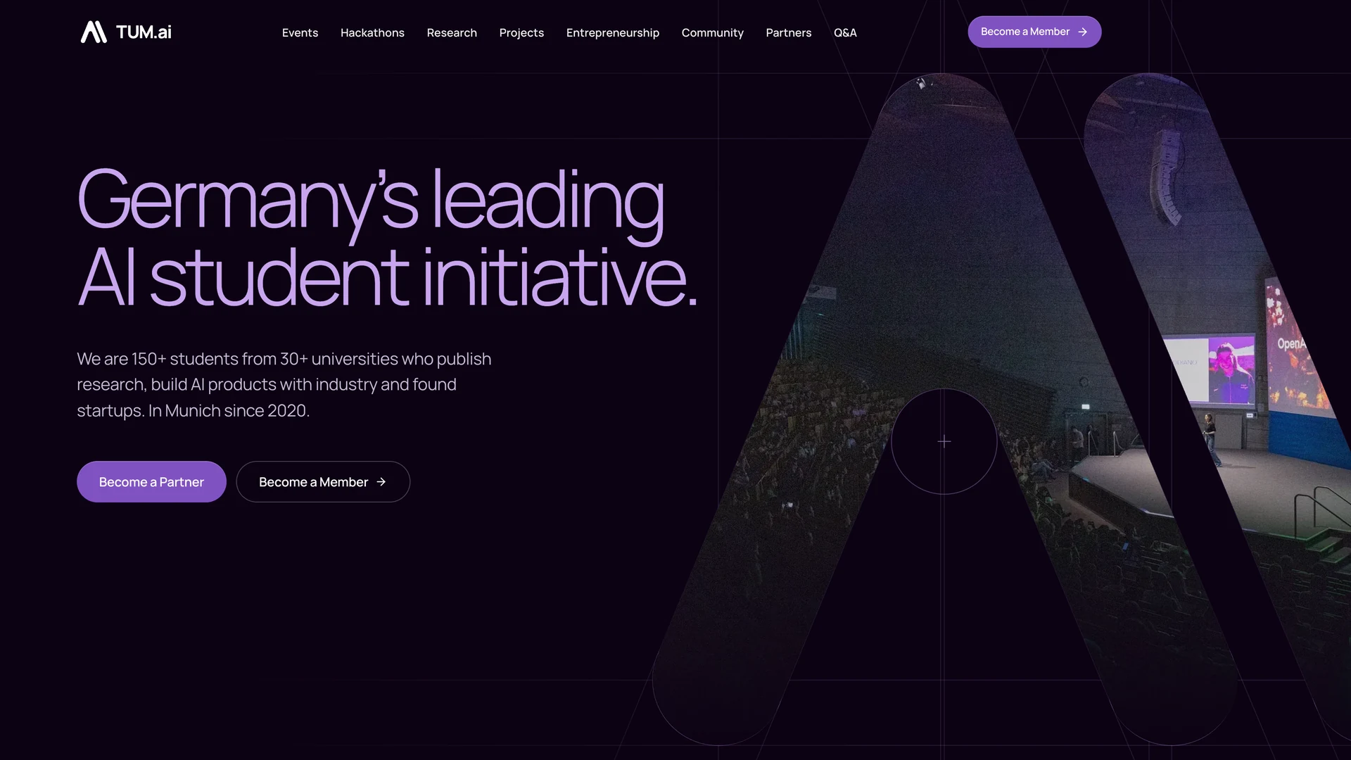
The TUM.ai website had a number problem. The Apply page said the initiative had "over 90 active members". The homepage said the same in its intro text, while a stats row in the same file listed "400+" alumni and "33+" nationalities. The Partners page said 150 active members and 850 alumni. Nobody was lying on purpose. Each number was typed into whichever file someone happened to be editing, and none of them knew about the others.
I led the redesign of tum-ai.com, where I'm Head of Software Development. Every page was rebuilt on one design system, translated from TUM.ai's 2026 brand guide, and that design system became @tum.ai/ui-kit, an npm package. The website, the Summit and the Makeathon run on it now.
A good part of this post is about what went wrong along the way: shared components that got rebuilt instead of used, screenshot tests that lied in both directions, and a tidy architecture rule the bundler quietly punished. The other part is the design, and what it pays back later: the Makeathon and Summit sites start from the same kit instead of from scratch, and the Summit site was built by someone who had never worked on the kit.
A rule nobody can forget
The member counts were the most visible symptom, not the only one. The old site mixed stock Tailwind greys and purples into the brand colours, had unlayered global button and a styles that components fought with !important, kept animating loops for visitors who had asked for reduced motion, and built its FAQ from clickable divs. Each of these is small. Together they are what a site looks like after many people have edited it over several years, each fixing the page in front of them.
The site URL alone was written out 26 times in a single SEO file. Here is what the member figures looked like:
1// src/components/apply/About.tsx2diverse group of over 90 active members, each with technical skills34// src/components/home/AboutSection.tsx5const STATS = [6 { title: "Alumni Members", value: "400+" },7 { title: "Nationalities", value: "33+" },8 ...9];10With over 90 active members, TUM.ai empowers the next generation1112// src/data/partners.ts13{ value: "1000+", label: "Official members", detail: "150 active, 850 alumni" },Correcting the numbers once would have lasted until the next edit. So the figures now live in one place, the siteSettings document in Sanity, where they can be changed in the Studio without touching code. Pages and structured data read them from there. The code only defines their shape and derives the rest, like the total membership:
1// src/config/site-settings-content.ts: one CMS document holds the figures2export const SITE_SETTINGS_QUERY = defineQuery(`*[_type == "siteSettings"][0]{3 organization{foundingYear, activeMembers, alumni, majors, universities, nationalities, ...},4 ...5}`);67// src/config/organization.ts: code derives from them, it never stores them8/** Everyone who has been an official member: active members plus alumni. */9export function officialMembersOf(10 facts: Pick<OrganizationFacts, "activeMembers" | "alumni">,11): number {12 return facts.activeMembers + facts.alumni;13}1415// Editable copy names a figure by placeholder, {{org.activeMembers}},16// and the page fills it in when it renders.The second half is what makes it stick. A guard test walks every source file and fails when it finds a fact typed straight into page code: "N active members", a role email, a social link, an application form URL. Its allowlist can only shrink, and the test says what to do when it fails: read the value from where it lives instead of silencing the pattern.
This is the first lesson, and the rest of the post keeps returning to it. A sentence in a contributing guide is a suggestion. A failing check with a message that names the right file is a rule.
Not a rewrite from zero
The site has a longer history than this redesign. The original tum-ai/website ran on Next.js with a three.js scene and content from Notion. Its successor, website_new, started as React 19 on Vite. Jakob Friedrich moved it to Next.js, Benjamin Hadizamani moved its content to Sanity, and the team that built its pages is the reason there was something to redesign at all. My own work on it started in September with an E-Lab refresh and a rebuilt partner page. The partner page set a higher bar than the rest of the site, and the redesign was the attempt to bring every other page up to it.
From a brand guide to a system
The look had a source too. TUM.ai has a 2026 brand guide: 17 slides with six colours and a gradient, the Manrope typeface in four weights, a construction grid for the logo, and section slides where a huge, faint "A" from the logomark fills the background. What it doesn't say is what a hover state looks like, which grey belongs on a dark band, or whether white text on the brand violet is readable on a button. A brand guide describes how TUM.ai looks. A website needs a lot of small decisions the slides never had to make.
So the first step was turning the guide's colours into tokens: named values the code can use. The brand colours became fixed points on a violet scale, and the shades in between were filled in from them. Then came the first real decision. White text on the brand violet, Electric Lavender, is hard to read: it reaches a contrast of about 4:1, and the accessibility standard WCAG AA asks for 4.5:1. So primary buttons use the next darker shade, #8052C2, which reaches 5.4:1. One colour isn't from the guide at all: the near-black behind the footer, #0D0214, was added in code for the darkest background.
The bigger idea is the tone band. A page is a sequence of full-width bands, and each band sets one of six tones. Components never pick a colour themselves. They ask the band for its text, muted text, hairline and accent colours, so the same card works on a white reading band and on a dark indigo hero. That's also why there is no separate dark mode: the dark bands are the dark mode. Where two light or two dark bands meet, the lower one fades in softly. Where light meets dark, the edge stays hard on purpose.
| Band | Canvas | Text | Used for |
|---|---|---|---|
paper | White#FFFFFF | Dark Indigo | Default reading band |
mist | Minimal Grey#EFEFEF | Dark Indigo | Alternate light band |
lavender | Lavender Tint#F5EFFF | Dark Indigo | Soft emphasis, forms, FAQs |
ink | Dark Indigo#1B0049 | White | Heroes, feature bands, calls to action |
night | Brand black, not in the guide#0D0214 | White | Deep contrast, footer |
violet | Electric Lavender#9A64D9 | Brand black | Large type only, sparingly |
Type and shape follow the same pattern: take what the guide shows and turn it into a rule. The guide sets its H1 at 120 points, and the kit's brand doc asks for "large, light-weight headlines", so the largest display size scales up to 8rem at weight 300 with tight letter spacing. The guide sets labels like "Primary Logo" in mixed case, never in capitals, so the kit's eyebrow labels never shout in all caps either. Even the guide's signature corner, one large radius and three small ones, is a utility class now.
The homepage hero takes the big faint A from the section slides and turns it into a window: event photos crossfade slowly inside the logomark, which is about as literal as the guide's "Our photos put you in the room" gets. The hero's construction lines need exact geometry, so its construction sheet draws its own mirror-symmetric A, with the feet where the official mark has them, and a test checks that every guide circle is tangent to the stroke it belongs to. The header keeps the supplied logo file.
Motion follows the guide's character as the kit's brand doc sums it up: precise, confident, calm and alive, where alive means "small, purposeful motion that is always optional". In code that is a house easing curve, five named durations, and ambient loops that don't run at all for visitors who asked for reduced motion.
Then comes the part that connects back to the member counts. In the kit, checks enforce the brand rules. A lint rule rejects raw hex values and stock Tailwind palettes, another rejects animations that skip the motion tokens, and a test fails if any tone's text, accent or focus colour drops below WCAG AA. The website itself still relies on written rules and design review for this, so the strict version of the rule lives in the kit, which is where most of the styling lives now anyway. One rule can't be linted, and the kit's brand doc states it plainly: "If a design starts to look like a generic SaaS template, simplify it."
What changed on screen
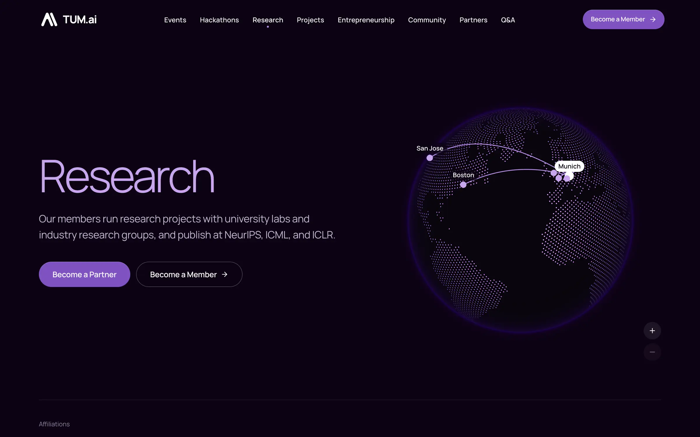
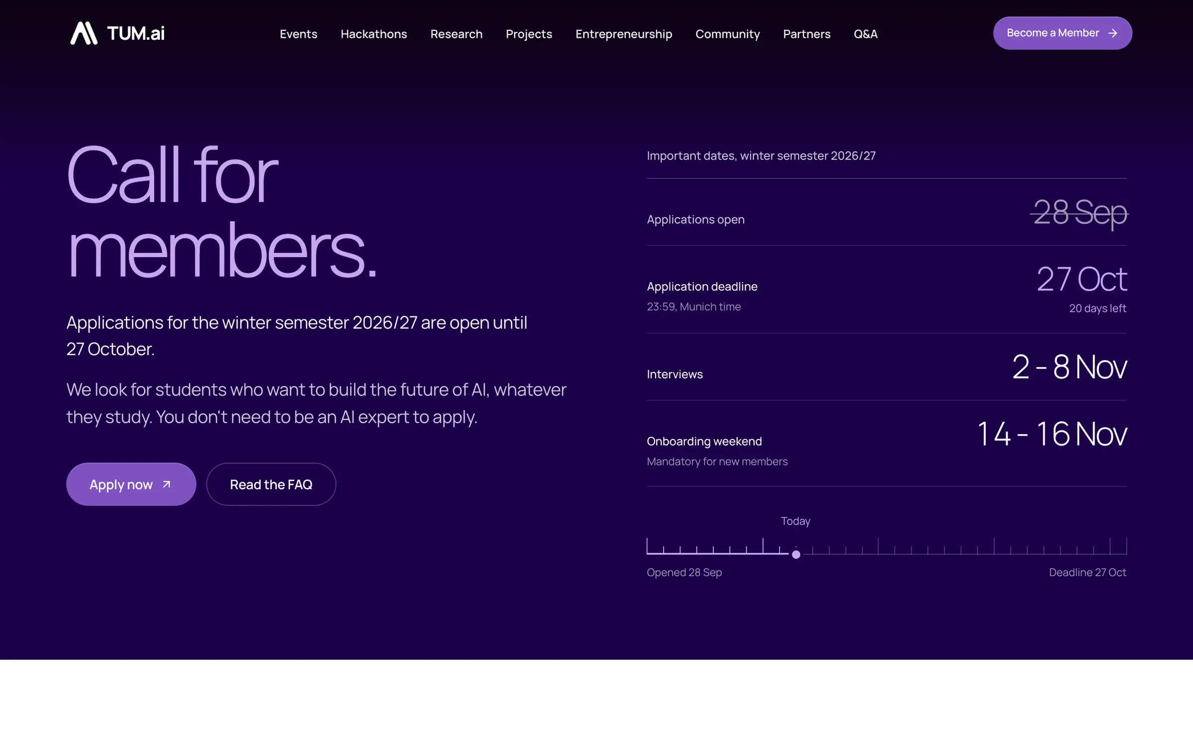
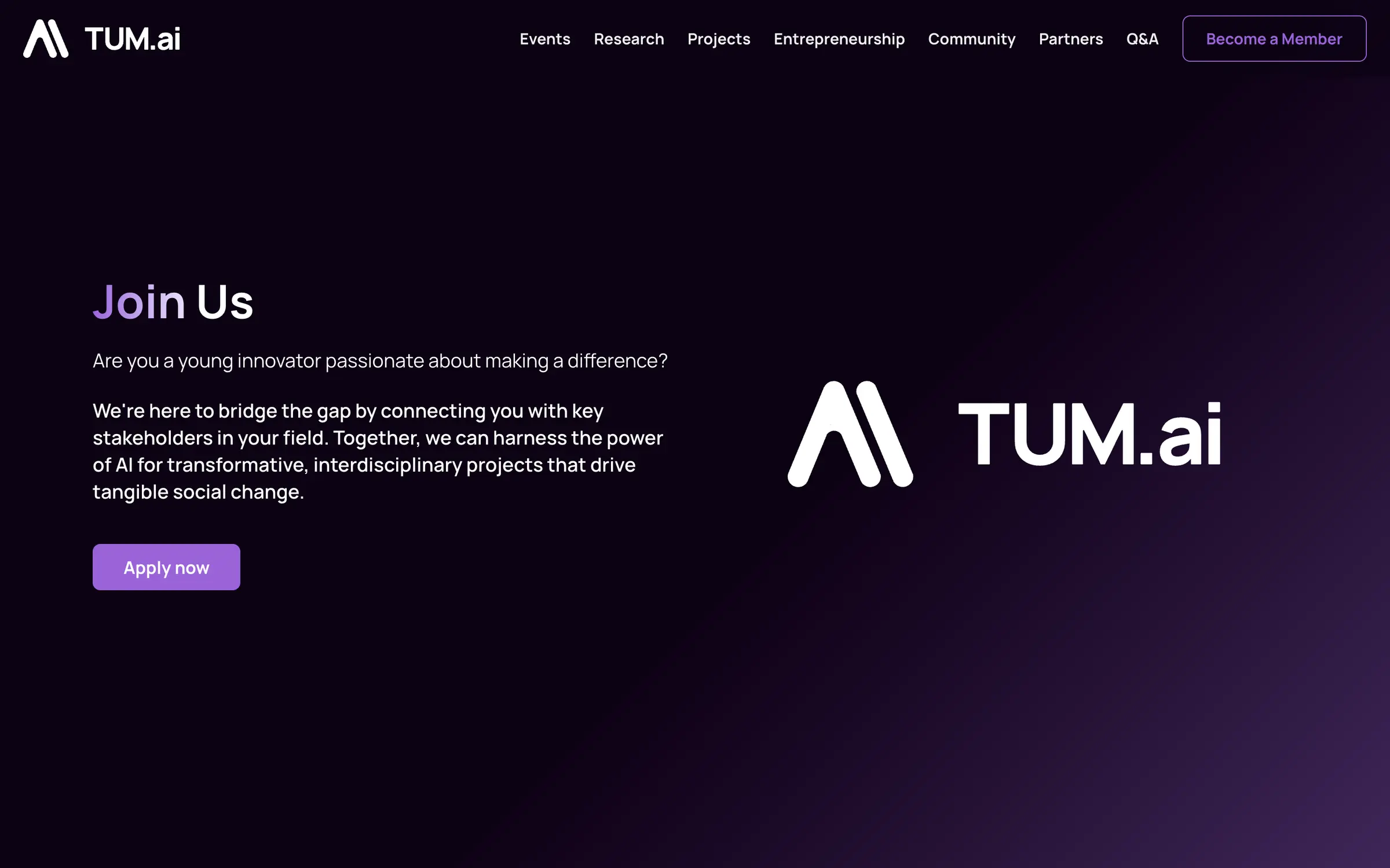
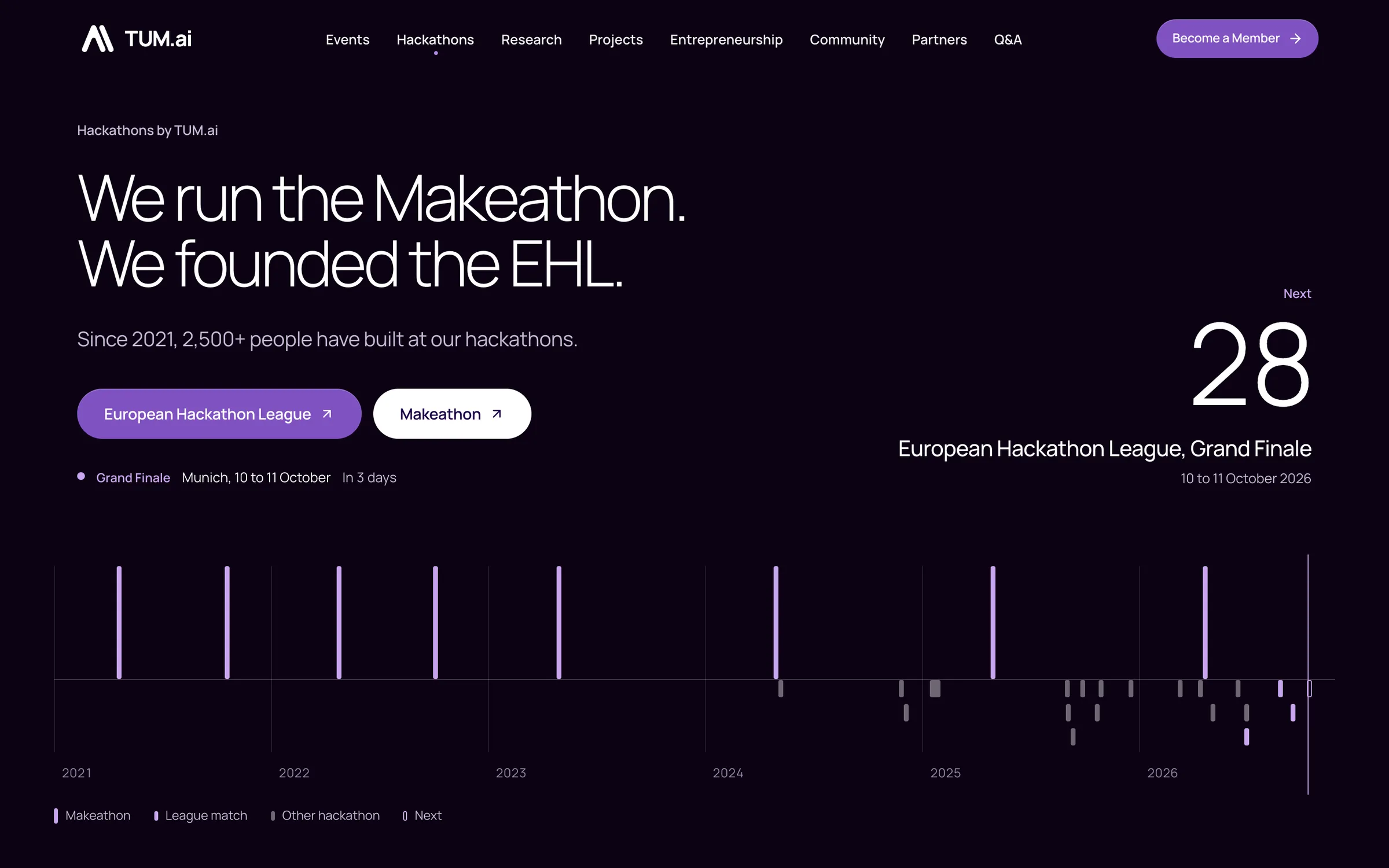
Here's what that system looks like on the pages. Every page now sits on it, and accordions, dialogs and the mobile menu are built on Base UI, so keyboard and screen reader behaviour come from a library instead of hand-written handlers. Drag the divider to compare.
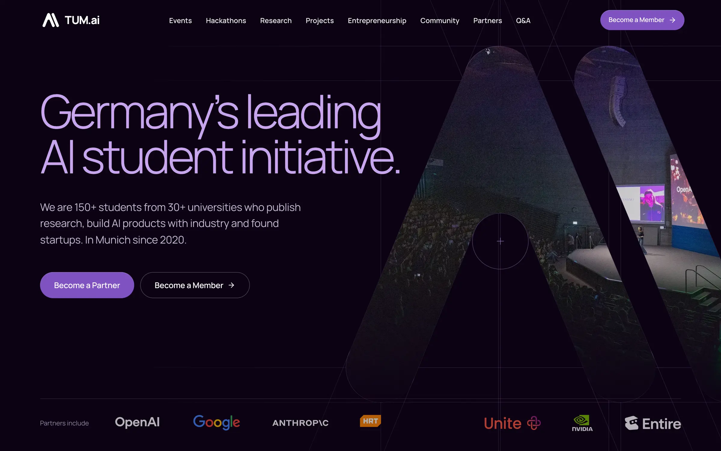
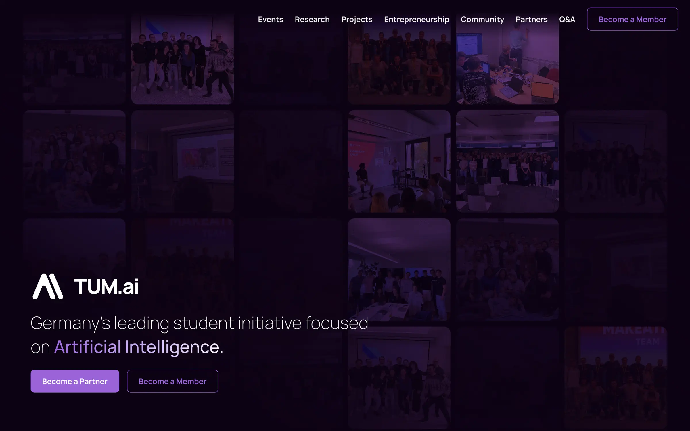


The homepage is only one page. Here are four more, old on the left of the divider and new on the right.
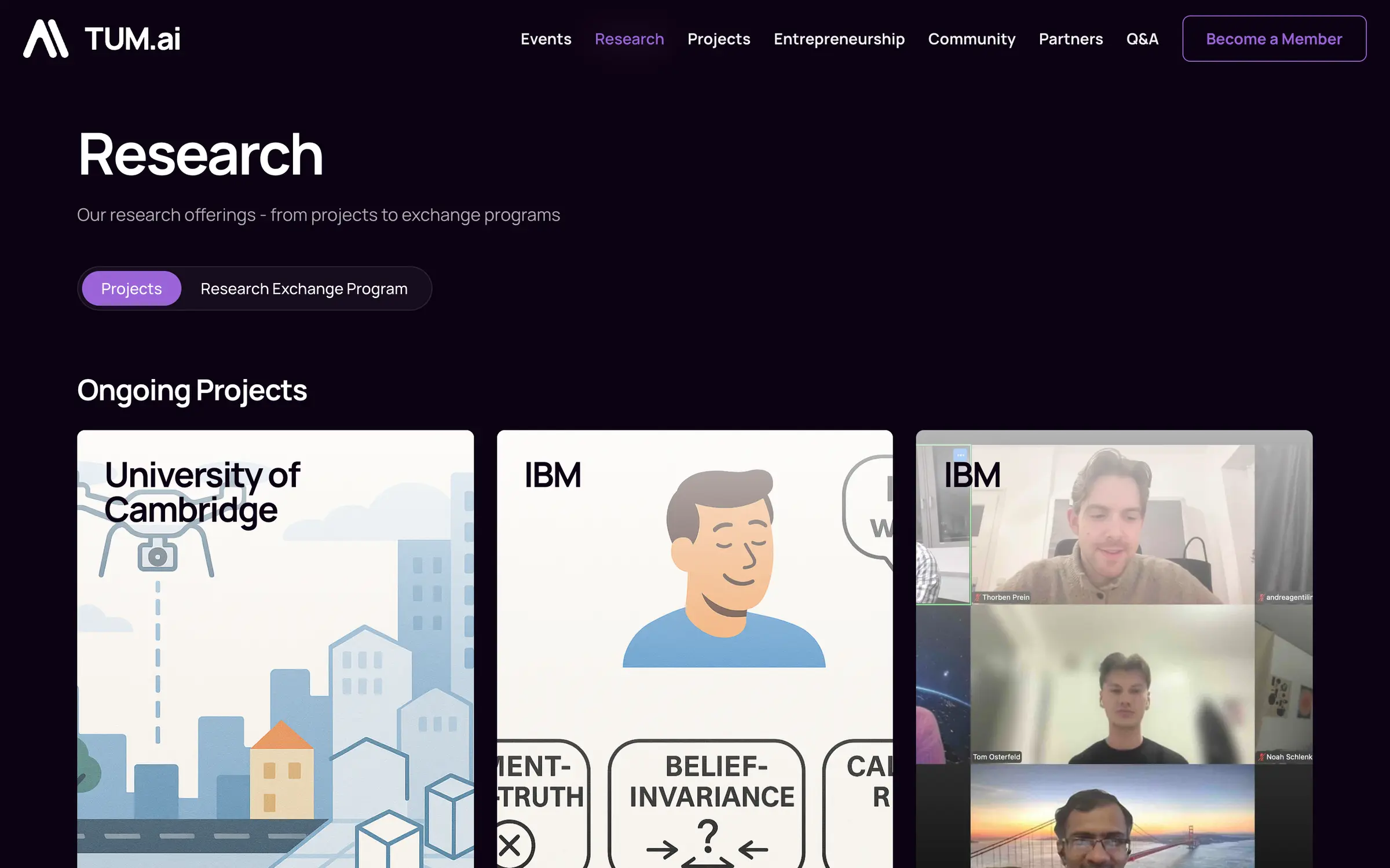

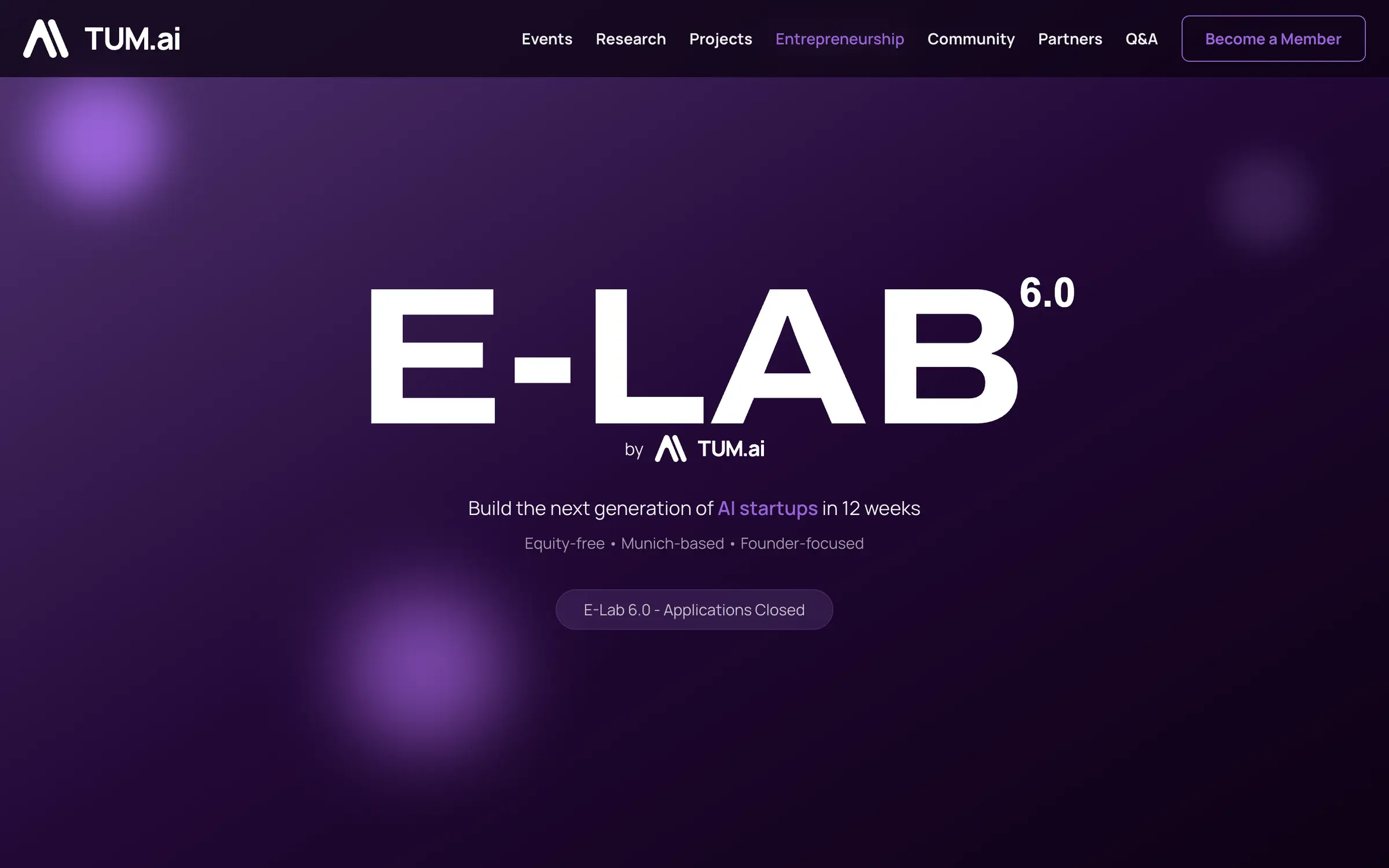
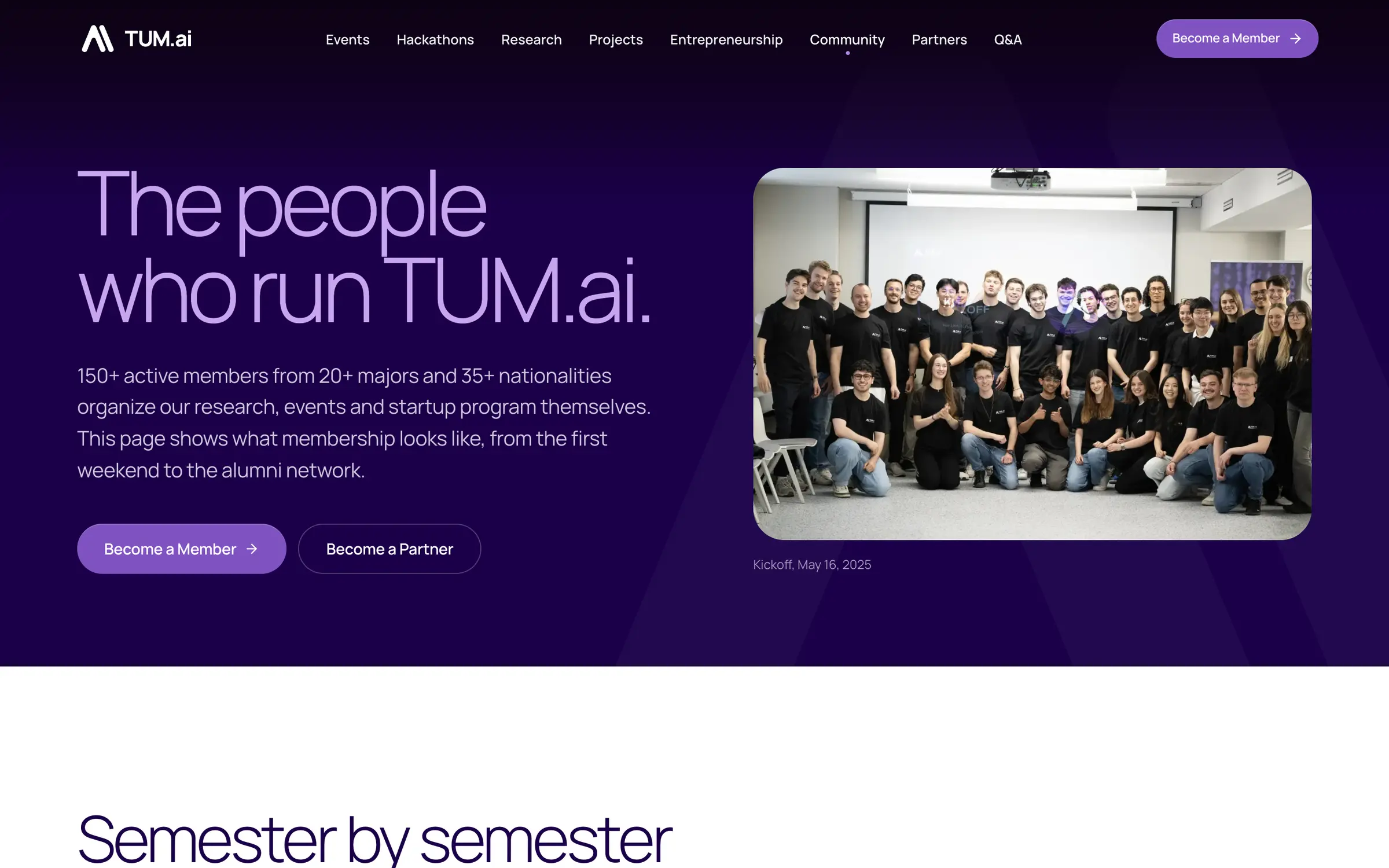
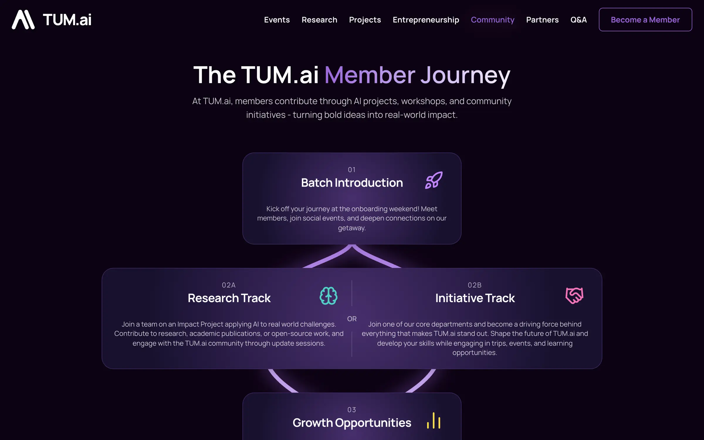
Structure the bundler agrees with
Before, one page's code was spread across five top-level folders. The E-Lab page had a route in src/app, its view in src/views, sections in src/components/e-lab, content in src/data/e-lab and helpers in src/lib. Now each domain is a feature folder, and routes stay thin:
1// before: main2src/3├── app/e-lab/page.tsx4├── views/headerPages/e-lab/ELab.tsx5├── components/e-lab/TimeLine.tsx, Testimonials.tsx, ...6├── data/e-lab/FAQ.tsx, e-lab.tsx, ...7└── lib/1// after: the redesign and cleanup branch2src/3├── app/(site)/e-lab/page.tsx // imports exactly one page module4├── features/e-lab/5│ ├── e-lab-page.tsx6│ ├── hero.tsx, venture-trace.tsx, ... (+ tests beside them)7│ ├── data/faq.ts8│ └── server.ts // CMS content getters, server-only9├── components/shell/ // header, footer10├── config/ // site facts: organization.ts, e-lab.ts, ...11└── lib/Layering is easy to draw and easy to ignore, so it's a test. src/architecture.test.ts reads every import from the TypeScript syntax tree and checks it against a table: a route may import its feature's page module, a feature may import the shell, config and lib, config may only import config and lib. There are no exceptions. An import that breaks a rule either changes the code or deliberately changes the rule.
The first version of that table had a rule that looked cleaner: every feature exposes its pages through an index.ts barrel. It didn't survive measurement. Turbopack keeps every re-exported module that has client islands or a CSS import, so the homepage shipped the partners page's interactive pieces in a 54 KB chunk, and the legal pages carried 17.7 KB they never used. The rule became "a route imports exactly its page module", and the restructure ended up with 18.6 KB less JavaScript per page.
Screenshots are a test you have to engineer
Every route has screenshot baselines at 390 and 1440 px in Chromium and WebKit. I expected that part to be the easy one. It wasn't.
- They were too heavy. The first baselines weighed 90 MB, up to 5.4 MB for a single full-page shot, and WebKit decoded the same photos differently between runs. Photos and film grain are now hidden during capture, which made the comparison stable and cut the set to 44 MB.
- The threshold lied. A ratio of 0.1% sounds strict, but on a long page it allows thousands of changed pixels. Switching to a fixed 100 pixels per screenshot immediately exposed nine baselines that had drifted unnoticed.
- They went stale anyway. When the website moved to the kit, all 48 checked-in screenshots from the older branch no longer matched the current rendering, and the capture bot had snapped some animations mid-state, a half-drawn timeline and a globe before its dots appeared. Those had to be fixed by hand.
Baselines are now captured only in CI, triggered by a label, never on someone's laptop. Visual regression is a real test, but it's a test you have to design like any other.
One more counterintuitive result: more CI shards made the pipeline slower. Each shard spends about a minute and a half on setup and its own build, so splitting further took a run from 3:56 to over 4:15. Parallelism has a fixed cost.
Pulling the kit out
The long-term goal had always been one design system for every TUM.ai site, not just the website. So once the website had one, I extracted it into @tum.ai/ui-kit, an MIT-licensed package built on Base UI with releases through changesets. Every site now gets the same buttons, tone bands and header without copying them.
I didn't want to extract it on trust. Twelve representative components had to produce identical screenshots at 320, 390, 768 and 1440 px inside and outside the website, a packed copy of the package had to work in a fresh Next.js app, and every Storybook story runs with strict axe checks. The verification document is also honest about what it doesn't prove: not every possible composition, and no VoiceOver or real-iPhone pass.
The FAQ shows what moving into the kit bought. This is the old one: a div with an onClick, no button semantics, no aria-expanded, nothing a keyboard can reach:
1{faq.map((faqItem, index) => (2 <div key={index}>3 <div onClick={() => setOpenFaqIndex(openFaqIndex === index ? null : index)}>4 <p>{faqItem.question}</p>5 <svg>{/* chevron */}</svg>6 </div>7 {openFaqIndex === index && <p>{faqItem.answer}</p>}8 </div>9))}The kit version wraps a Base UI accordion. Keyboard handling, ARIA state and focus come from the library, and the kit adds deep links, so a URL fragment opens the matching question:
1<Accordion value={open} onValueChange={(next) => change(next as string[])}>2 {items.map((item) => (3 <AccordionItem key={item.question} value={item.question} id={item.id}>4 <AccordionTrigger headingAs={headingAs}>{item.question}</AccordionTrigger>5 <AccordionPanel>{item.answer}</AccordionPanel>6 </AccordionItem>7 ))}8</Accordion>Who owns what is written down in an ADR. The kit owns component behaviour, styling, tokens and their tests. The website owns routes, content and data. Kit code is never copied or patched inside a site: a fix goes upstream, gets released and arrives through a version bump. Moving the website onto the package was mostly deletion, and the before and after screenshots came out with identical dimensions. It wasn't a perfect fit either: one small class-merging helper stayed local because the kit didn't export it yet.
A Tailwind-based kit has one hidden cost. If a consumer's bundler stops picking up the kit's source, its components render unstyled while the site's own classes still work, and nothing fails. The Makeathon build now ends with a check that looks for a few kit-only selectors in the output CSS.
Every new site starts ahead
The real test of a shared kit is whether the next site gets built with it. The old Makeathon site had its own, older design. Its successor, now live at makeathon.tum-ai.com, is built on the kit. Here is the old site next to the new one:
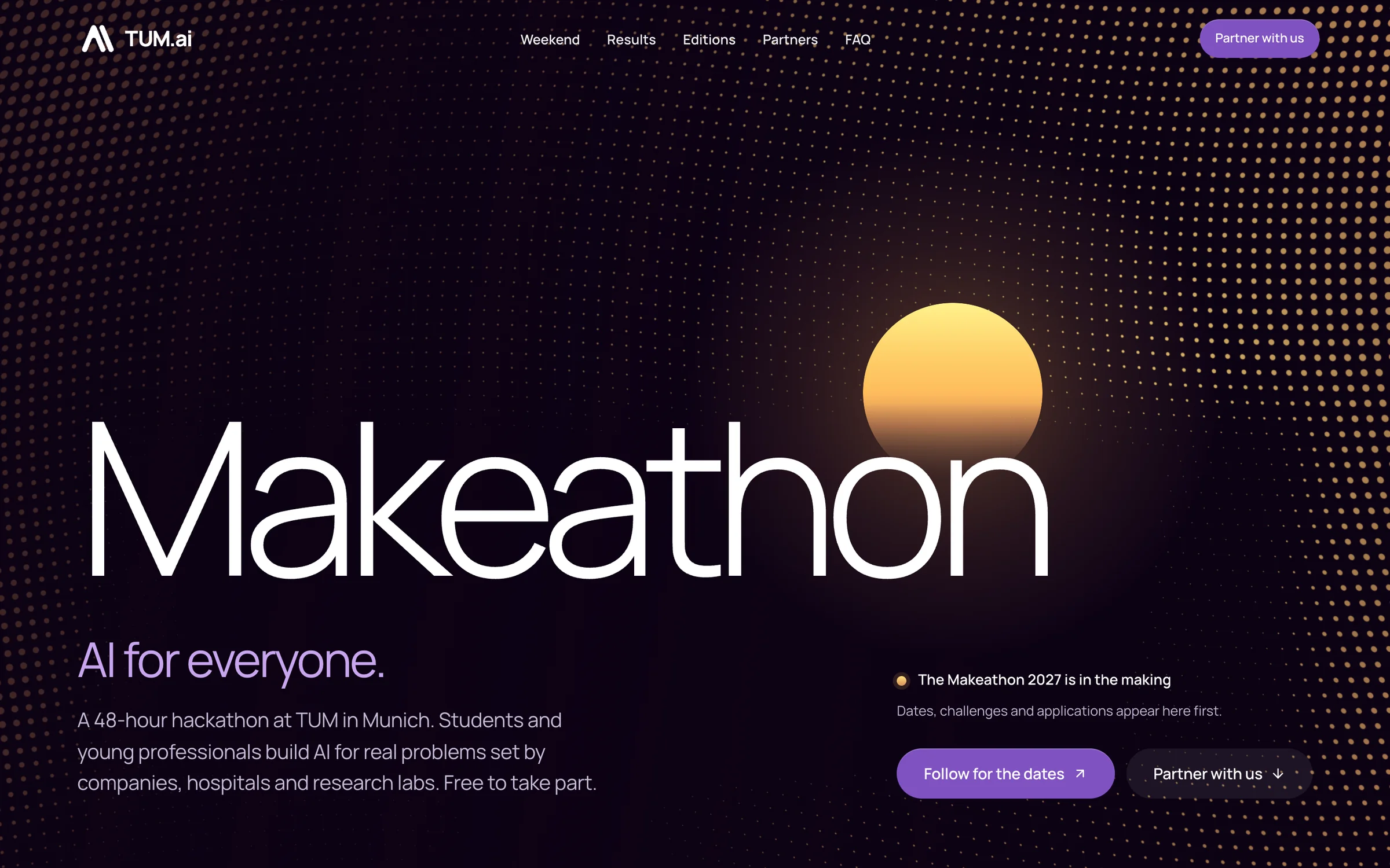
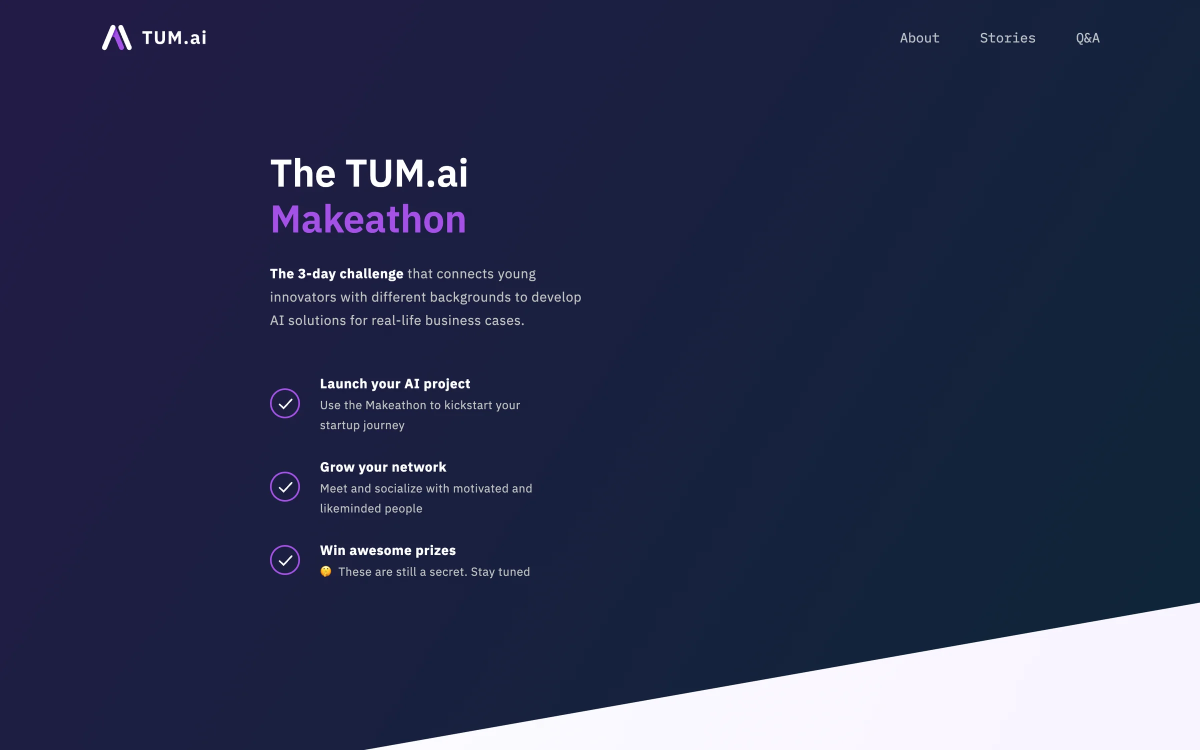
The new Makeathon site was scaffolded on a packed copy of the kit and switched to the published npm package once it was out. Almost none of its code is UI basics. There is no button, accordion, header or footer in it. Those come from the kit. What's left is what makes the Makeathon the Makeathon: a sun that moves with the real sky over the campus, a replay of the weekend hour by hour, the results and the history of every edition.
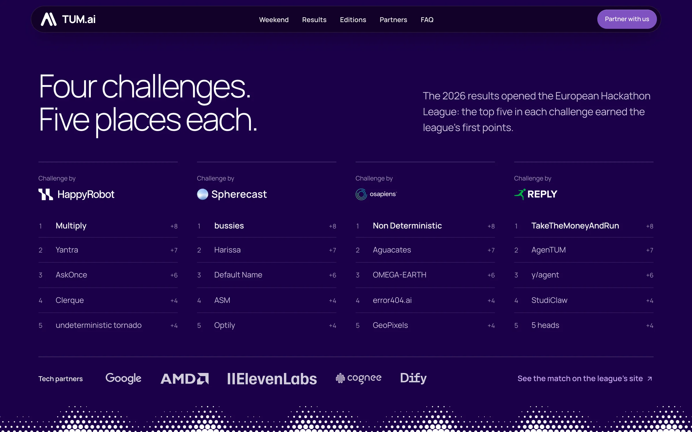
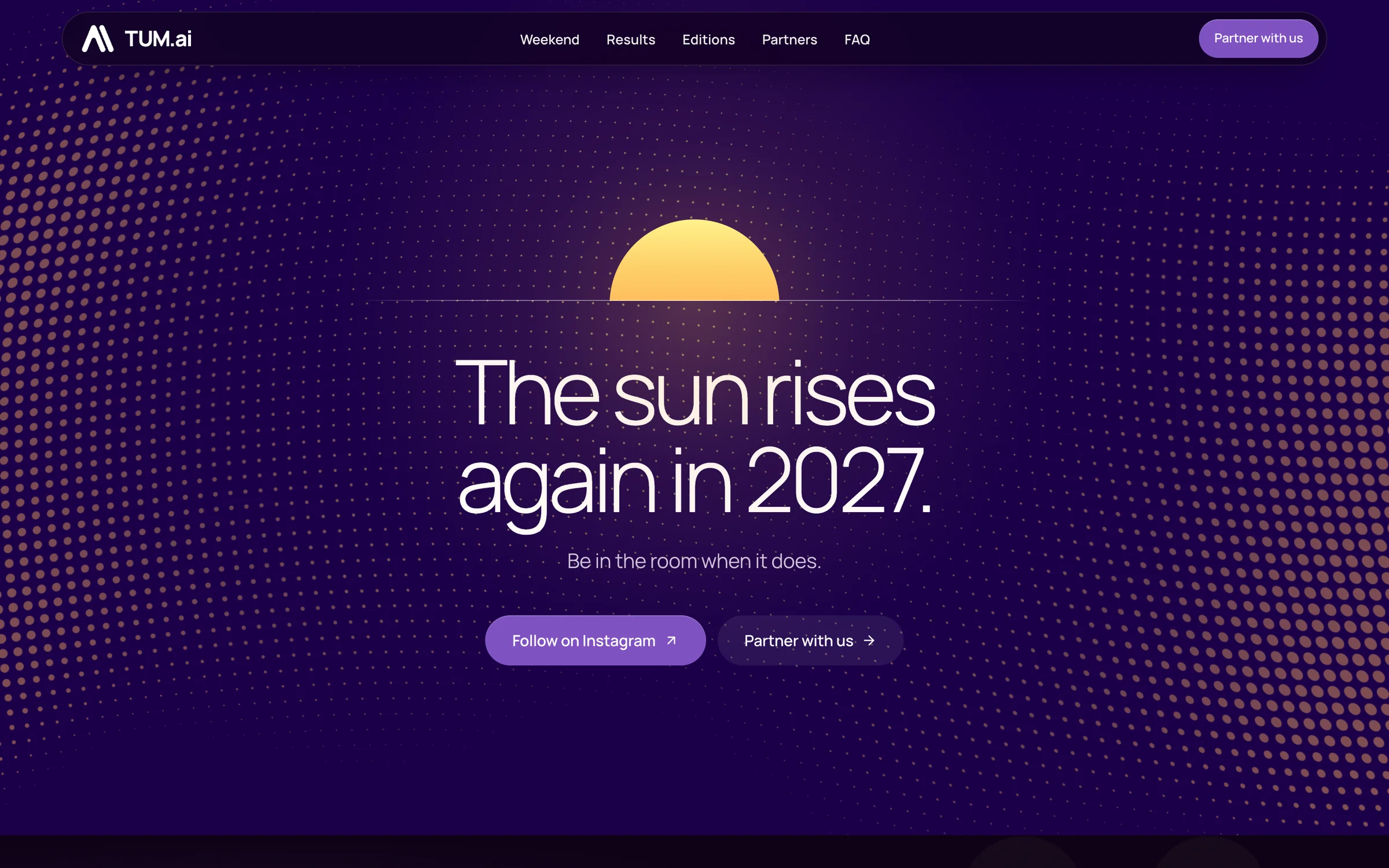
That's what uniform means in practice. The new Makeathon site looks like TUM.ai not because someone checked it against a style guide, but because it imports the same components. A written rule in the repository keeps it that way: before building a new component, ask whether another TUM.ai site could use it, and if so, stop and propose it for the kit.
Then a component travelled the other way. The halftone dot field and the sun started in the Makeathon site, and the website's hackathons page wanted them too. Instead of a second copy, both moved into the kit as an opt-in subpath, 4.1 kB with brotli including the lazily loaded WebGL renderer, and the Makeathon deleted its own copy. That's the loop a kit exists for: a component proves itself in one site, moves up, and the original copy disappears.
The third site is the harder test, because I didn't build it. Timur Hegwein built the site for the TUM.ai Summit in San Francisco without having worked on the kit before. Wiring it in took an npm install, three CSS imports and the usual Tailwind setup. From there the page is mostly composition: header, footer, sections, stat grid, cards and the call-to-action band all come from the kit, 18 components plus the site shell by now. His own code in the first version is mostly the hero and the event content, the part that is actually about the Summit.
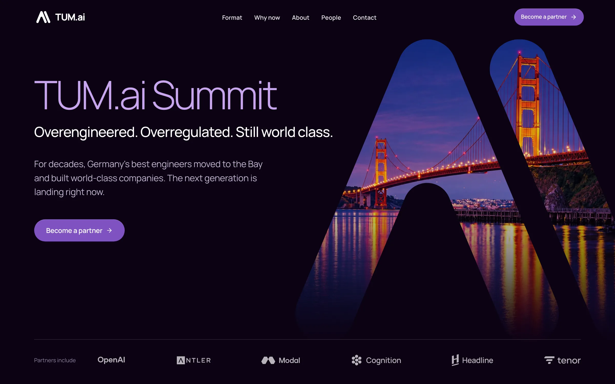
It still wasn't completely free of friction. The site works around the kit in three small places: it hides a scrollbar in the kit's header navigation, builds its own partner row because the kit's logo wall assumes a light band, and forces the stat grid into one column on phones. Its hand-built hero is the halftone story waiting to happen again: the next obvious candidate to move up into the kit.
What the kit keeps saving
The quieter win comes after launch. When the kit shipped two fixes for how iPhone Safari colours its toolbars behind the open menu and behind dialogs, the website got each one as a version bump, one line in package.json plus the lockfile. The Summit site started on the fixed version and never had the bug. Nobody on that project had to learn how Safari tints its toolbars.
The same goes for everything that's tedious to get right. Timur never had to write a contrast check, keyboard handling for a menu or a reduced-motion fallback, so a new TUM.ai site starts with that work already done instead of owing it.
Design gets the same shortcut. For each stable release, the kit generates its Figma library from code, so CSS and TypeScript stay the source of truth and Figma mirrors them once someone runs the updater plugin. Whoever designs the next TUM.ai site starts from the components that actually ship, not from a library that quietly drifted away from the code.
Sites pin an exact kit version, so an upgrade is always a deliberate one-line bump. The kit keeps saving time as long as someone bumps those versions and carries what a site learns back into it. That's real work, just far less of it than building each site from scratch.
What I'd tell the next person
- Write the rule as a failing test. Guidelines get ignored. Nobody can merge past a red check that says which file to fix.
- Budget time for the screenshots themselves. Visual baselines are the best refactoring safety net I know, once you've made them stable, sized and honest.
- Measure the architecture. A clean import rule cost real kilobytes until the bundle numbers said so.
- Turn the brand guide into rules, not just tokens. A palette in a PDF drifts. A lint rule against raw colours and a contrast test for every tone don't.
- Shape a kit with a second consumer, and judge it by the third. The Makeathon site is why the kit has a clear API. Without a second user, it would have been the website's components with a package.json. The Summit site, built by someone who had never worked on the kit, shows that the API also makes sense from the outside.
The part I'm proudest of is the boring part. The next person who hardcodes a member count, imports across layers, shifts a layout by accident or slips an off-brand colour into the kit gets a failing check that tells them what to fix. And the next person who needs a TUM.ai site starts where the Summit started, not where the website did. That's what a redesign that stays rebuilt means to me.